Product evaluation
Product evaluation
Magazine pitch

Process

My "flat plan" and first draft that i made using images from a game called 'Gris'. I decided on using the fonts IMPACT for the masthead and SEGOE UI for the sell lines and strap line because they looked nice together and matched the minimalist theme I wanted for my magazine.
Creating an audience profile to understand my target audience is looking for and what I should include to make a successful magazine.

My game concept: Thriller Point & Click Adventure game set in the main characters dreams with a main theme based on Performance - I randomized it using the website random-game-idea-generator.
It is set in Canada, in the fictional town of Thamvil Lake, a small town situated besides a lake, that is known for its theatre and nightlife.


I realised the purple didn't work well with the green background so I had to make some changes to the masthead to fit the colour scheme.
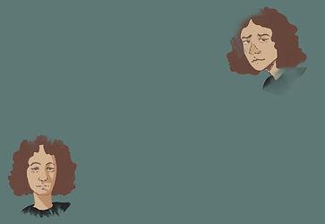
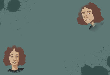
I also didn't like that the my drawing ended abruptly so I used an inkblot overlay to make it look smoother at the edges and more pleasing to look at.

working out the layout, colour palette and content of my sell and strap lines.
My double page spread idea; will be about an exclusive interview with the studio making the new game and will introduce the main character.